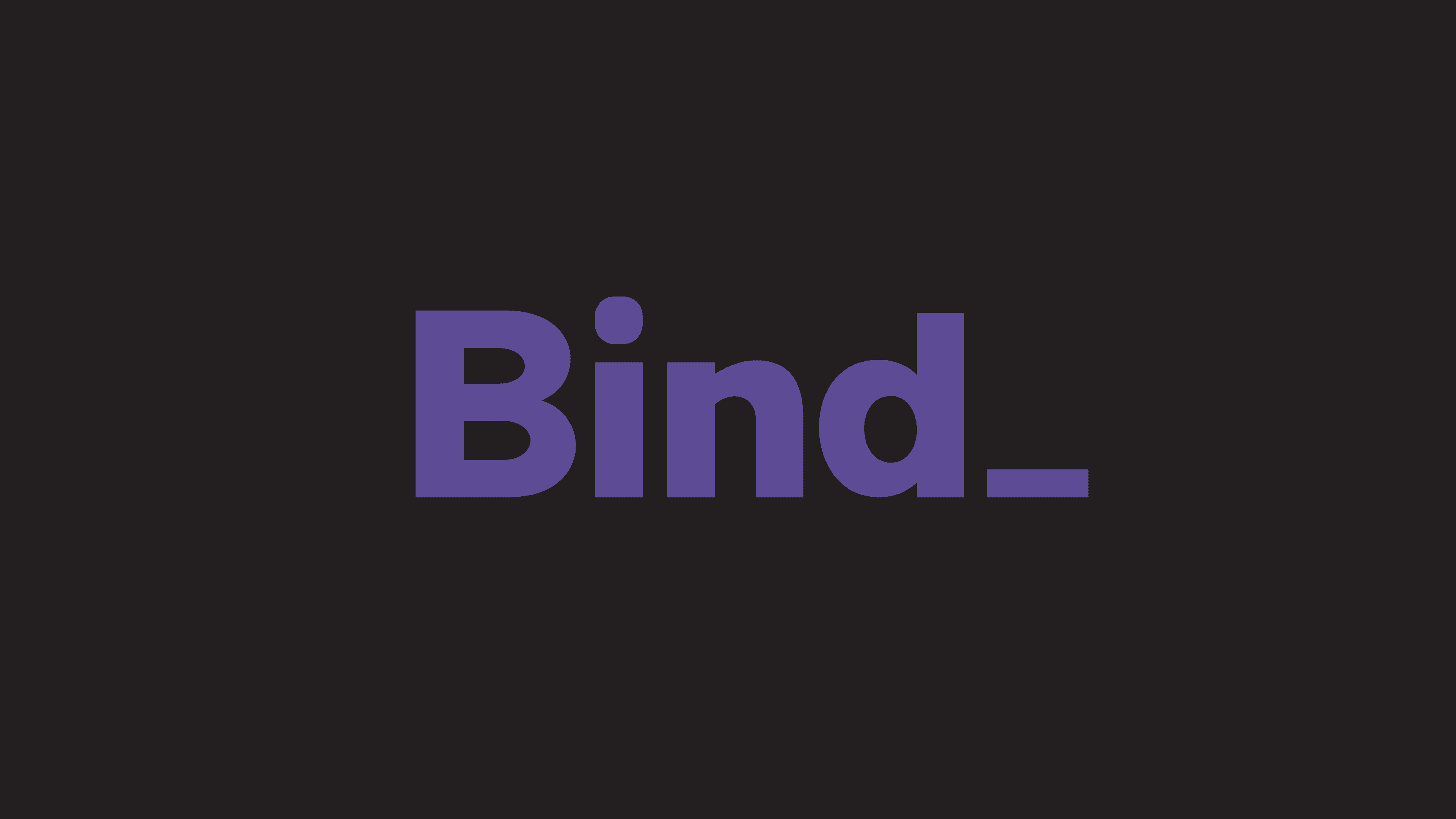
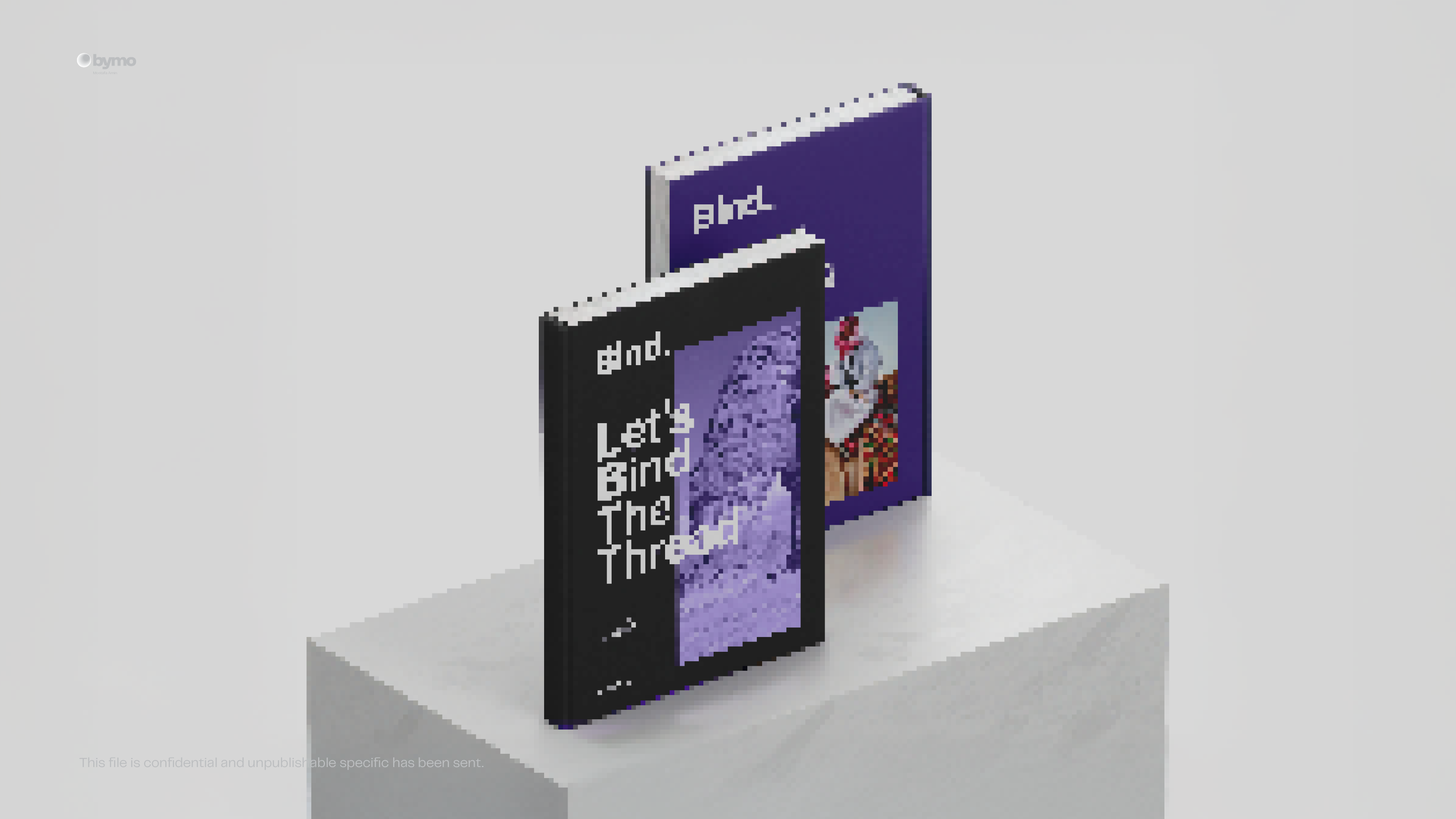
Bind_
We reimagined BIND’s identity to reflect clarity, confidence, and creative strength.
Rooted in the concept of connection, the brand now communicates precision, purpose, and powerful alignment between strategy and execution.
Coming soon
Know more
A bold rebrand for a creative agency that bridges strategy with results. BIND’s new identity system blends structured design with expressive energy establishing it as a refined and results-driven player in the advertising space.®
A Rebrand that Connects Ideas to Impact.
BIND is a creative agency known for its sharp thinking and real-world results — but its visual identity no longer reflected its ambition. We were brought in to reposition BIND as a high-caliber player in the advertising world, with a brand that communicates trust, talent, and transformation.
The concept of connection became the driving force not just visually, but strategically. The final identity strikes a balance between bold creativity and clean professionalism, giving BIND a voice that commands attention across every touchpoint.
Problem
As BIND grew, its previous identity began to feel inconsistent and limited in its ability to reflect the agency’s evolving capabilities. It lacked visual cohesion and the modern edge required to compete in a saturated creative market.
The challenge was to elevate the brand without losing its bold spirit creating something visually confident, yet flexible enough to scale across both traditional and digital media.
In today’s fast-paced, technology-driven world, the connection between humans and nature has been severely eroded. Urban sprawl, pollution, and the demands of modern life have left little room for the tranquility and inspiration that natural landscapes once provided. People are increasingly feeling disconnected from the outdoors, leading to stress, burnout, and a longing for spaces that offer peace and rejuvenation. The magic of untouched meadows, serene forests, and vibrant ecosystems is fading, replaced by concrete jungles and digital distractions. This disconnect not only impacts mental and physical well-being but also diminishes our appreciation for the environment. Mystic Meadows aims to bridge this gap, rekindling the lost bond between humanity and the natural world.

Solution
A structured, expressive identity rooted in connection and creative clarity.
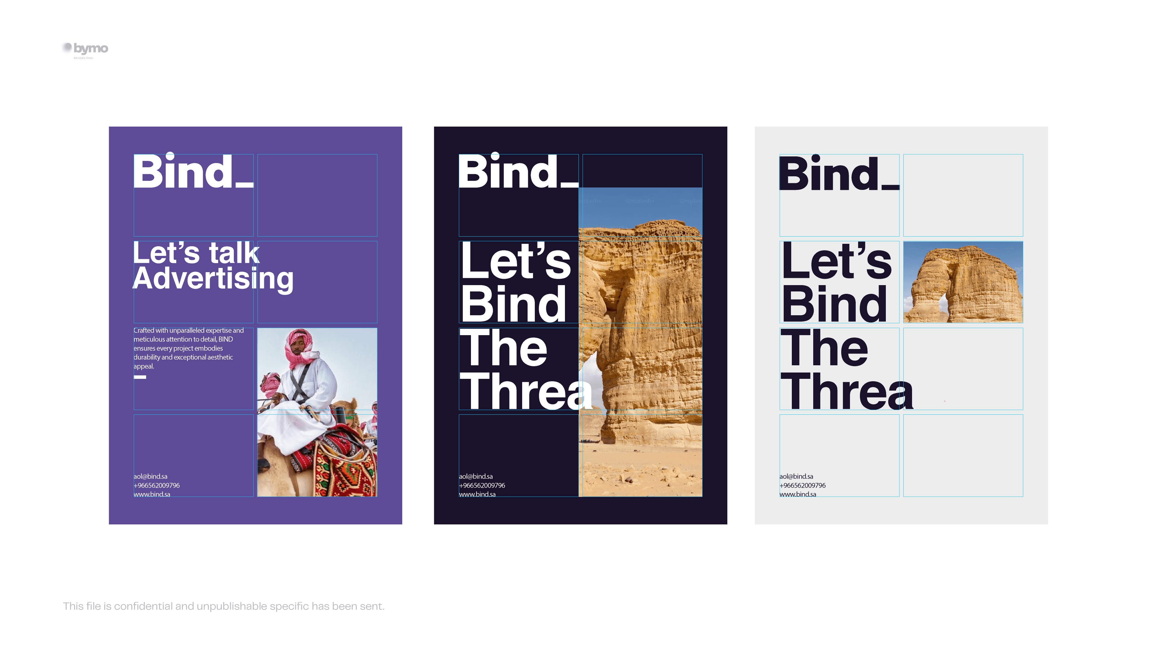
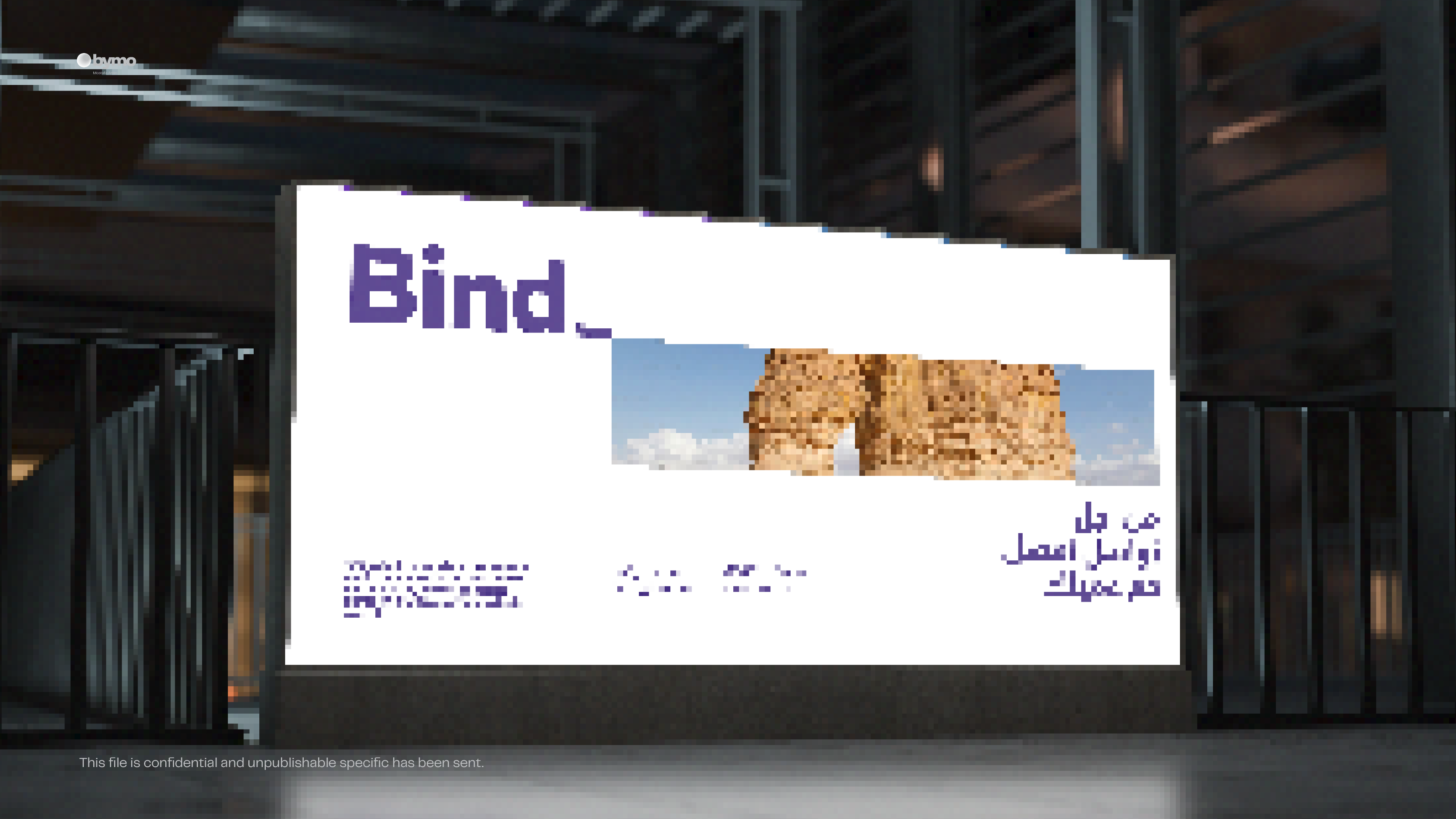
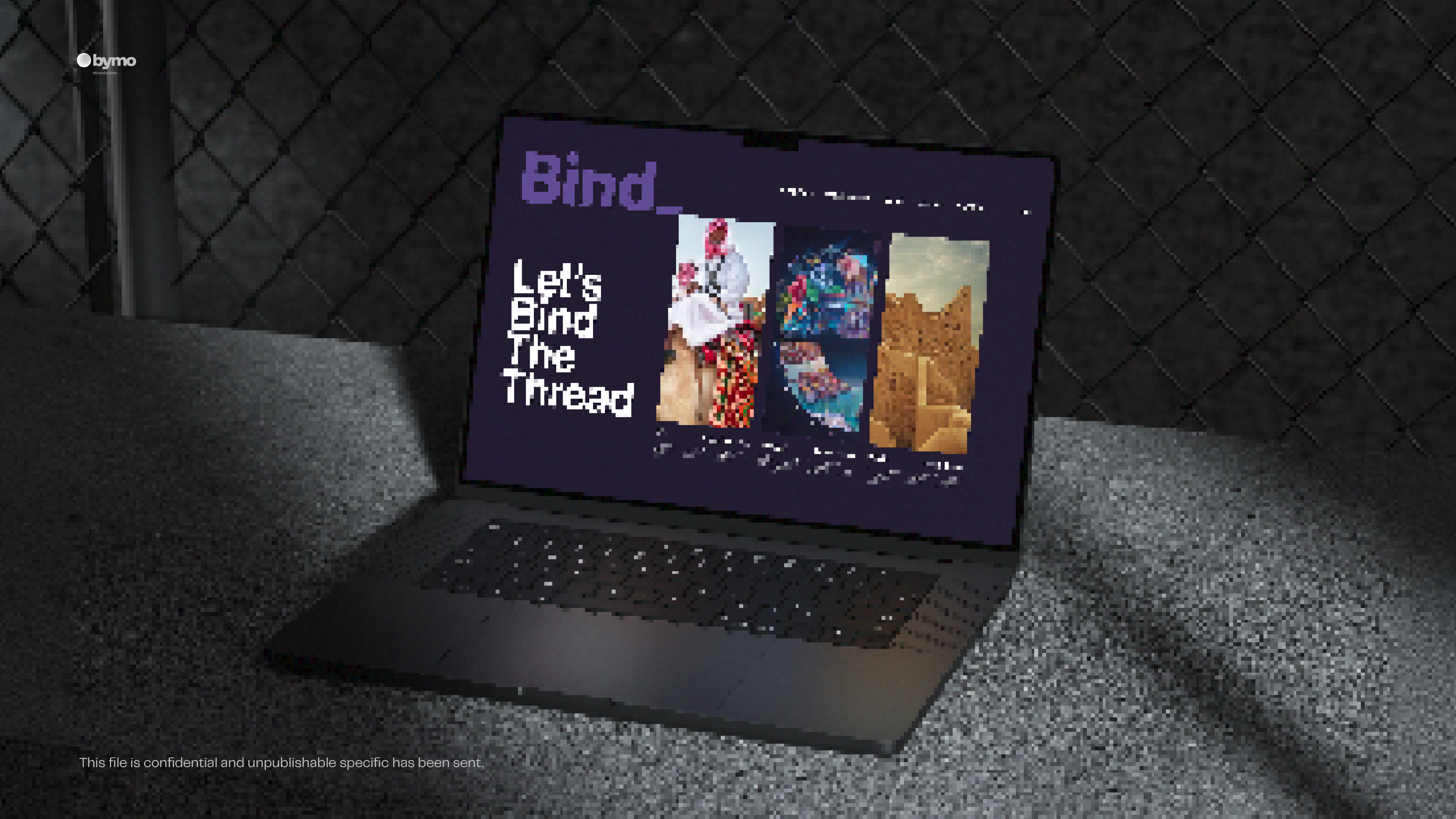
We developed a full identity system that captures the essence of creative alignment pairing bold, geometric typography with a balanced color palette to convey both precision and energy. The custom logotype emphasizes unity, while the supporting design elements offer flexibility across content types and formats.
The rebrand now gives BIND a unified presence, adaptable from pitch decks to social campaigns, while remaining unmistakably distinctive.
Concept
The power of connection between concept, execution, and results.
“Bind” is about linking people, ideas, and outcomes. The visual concept reflects this through strong alignment, structural harmony, and purposeful space. Every design element from layout systems to iconography supports the idea of clarity through connection.
The rebrand doesn’t just look good it works harder, positioning BIND as a creative force with the confidence to lead and the discipline to deliver.
More Works
(GQ® — 02)
©2024
Bind_
We reimagined BIND’s identity to reflect clarity, confidence, and creative strength.
Rooted in the concept of connection, the brand now communicates precision, purpose, and powerful alignment between strategy and execution.
Coming soon
Know more
A bold rebrand for a creative agency that bridges strategy with results. BIND’s new identity system blends structured design with expressive energy establishing it as a refined and results-driven player in the advertising space.®
A Rebrand that Connects Ideas to Impact.
BIND is a creative agency known for its sharp thinking and real-world results — but its visual identity no longer reflected its ambition. We were brought in to reposition BIND as a high-caliber player in the advertising world, with a brand that communicates trust, talent, and transformation.
The concept of connection became the driving force not just visually, but strategically. The final identity strikes a balance between bold creativity and clean professionalism, giving BIND a voice that commands attention across every touchpoint.
Problem
As BIND grew, its previous identity began to feel inconsistent and limited in its ability to reflect the agency’s evolving capabilities. It lacked visual cohesion and the modern edge required to compete in a saturated creative market.
The challenge was to elevate the brand without losing its bold spirit creating something visually confident, yet flexible enough to scale across both traditional and digital media.
In today’s fast-paced, technology-driven world, the connection between humans and nature has been severely eroded. Urban sprawl, pollution, and the demands of modern life have left little room for the tranquility and inspiration that natural landscapes once provided. People are increasingly feeling disconnected from the outdoors, leading to stress, burnout, and a longing for spaces that offer peace and rejuvenation. The magic of untouched meadows, serene forests, and vibrant ecosystems is fading, replaced by concrete jungles and digital distractions. This disconnect not only impacts mental and physical well-being but also diminishes our appreciation for the environment. Mystic Meadows aims to bridge this gap, rekindling the lost bond between humanity and the natural world.
Solution
A structured, expressive identity rooted in connection and creative clarity.
We developed a full identity system that captures the essence of creative alignment pairing bold, geometric typography with a balanced color palette to convey both precision and energy. The custom logotype emphasizes unity, while the supporting design elements offer flexibility across content types and formats.
The rebrand now gives BIND a unified presence, adaptable from pitch decks to social campaigns, while remaining unmistakably distinctive.
Concept
The power of connection between concept, execution, and results.
“Bind” is about linking people, ideas, and outcomes. The visual concept reflects this through strong alignment, structural harmony, and purposeful space. Every design element from layout systems to iconography supports the idea of clarity through connection.
The rebrand doesn’t just look good it works harder, positioning BIND as a creative force with the confidence to lead and the discipline to deliver.
More Works
©2024